Steven Kinder

Steven Kinder, Suite of 14 small framed works on paper.

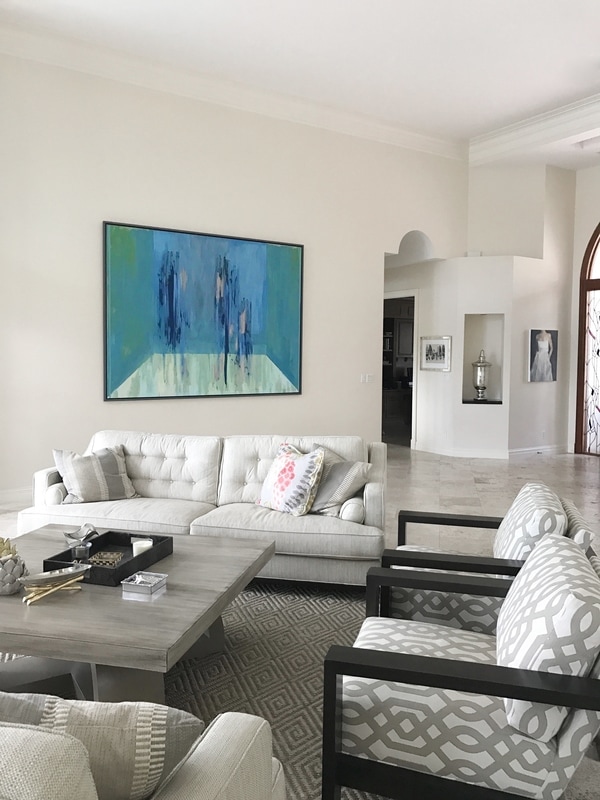
Steven Kinder, paintings and works on paper currently available.


ARTIST STATEMENT
George Billis Gallery is pleased to announce two consecutive solo exhibitions of new work by Steven Kinder located at Red Dot Miami 2017, Miami from December 6 – 10, and George Billis Gallery 525 West 26th Street, New York, on view December 14 - January 18, 2018.
This will be Kinder’s forth project with George Billis Gallery and second solo-exhibition at the New York gallery.
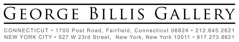
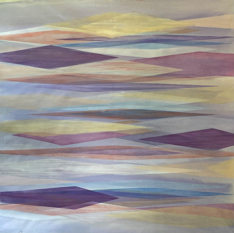
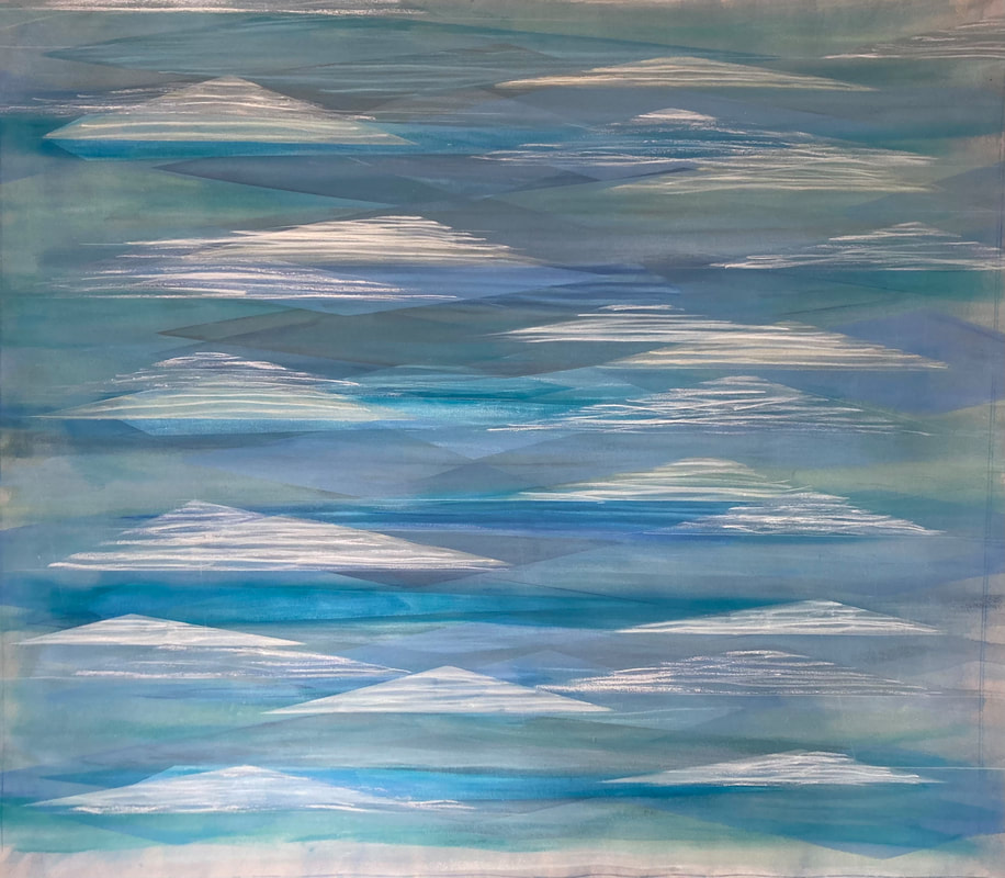
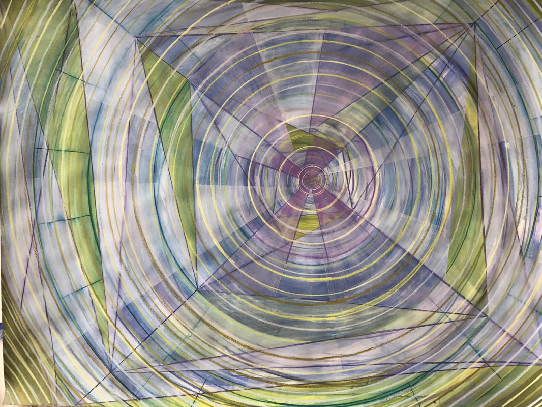
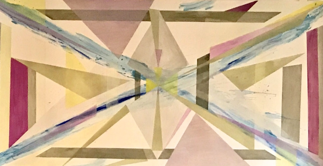
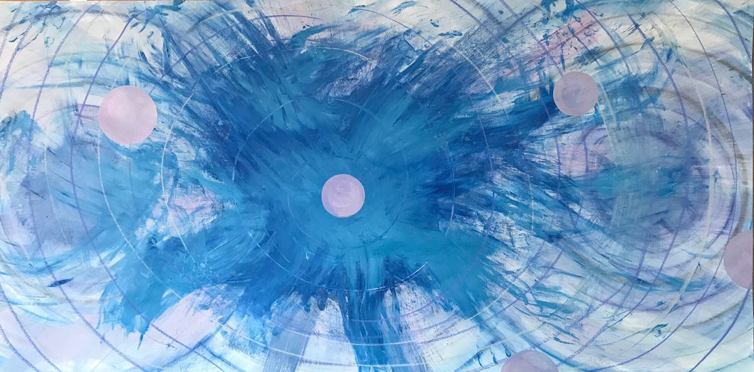
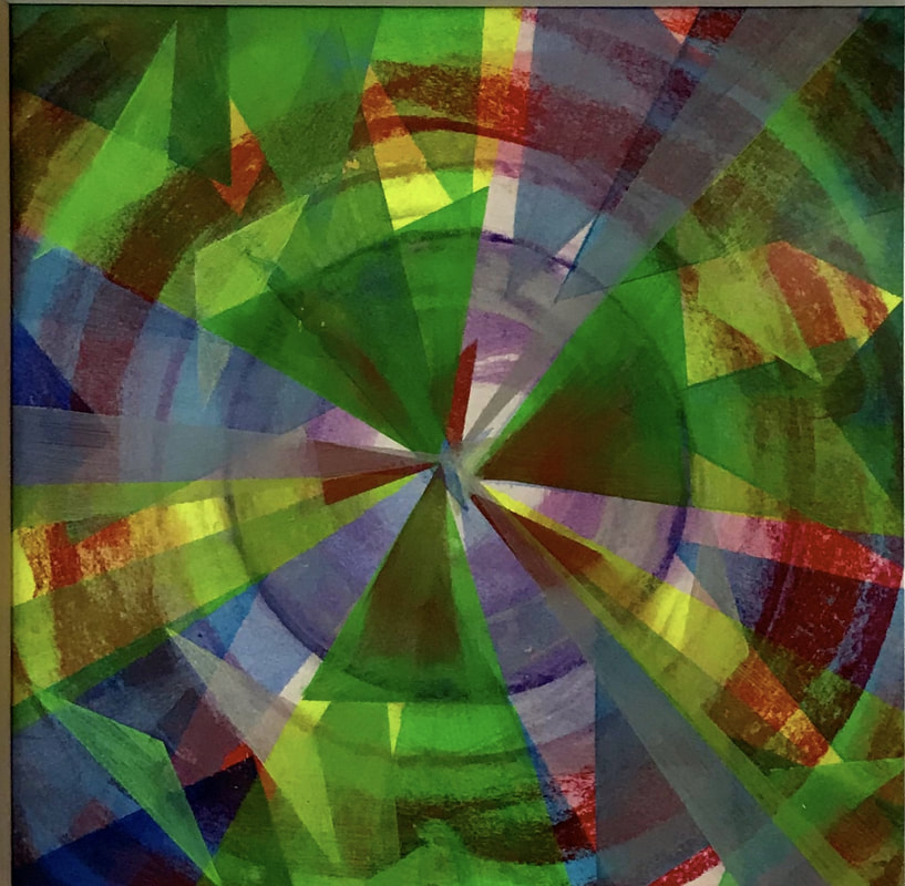
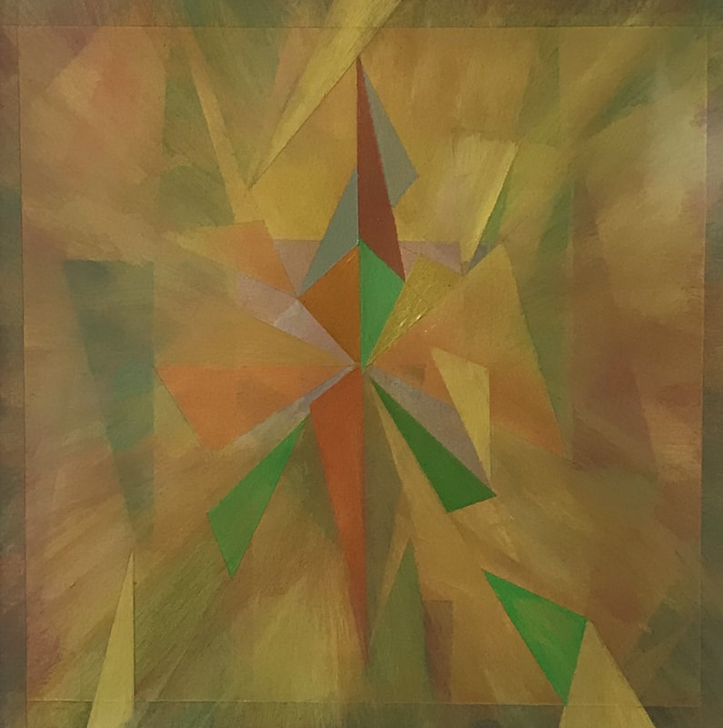
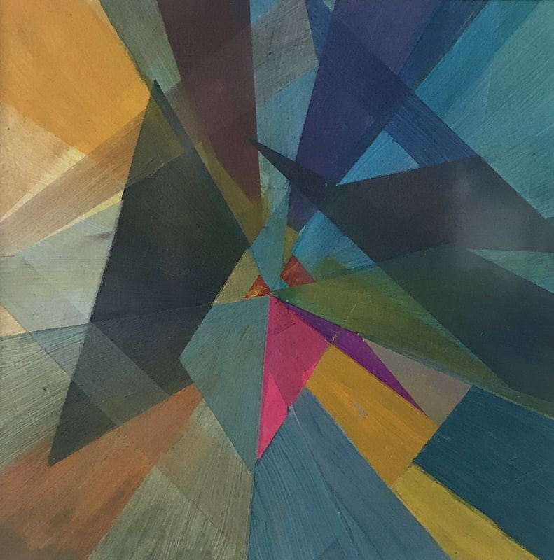
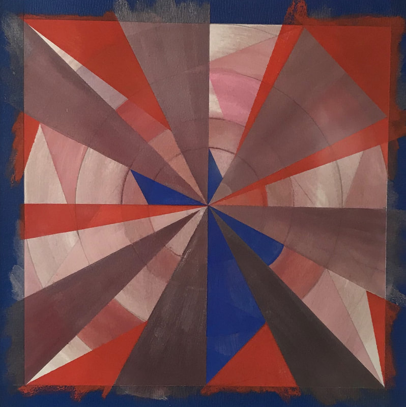
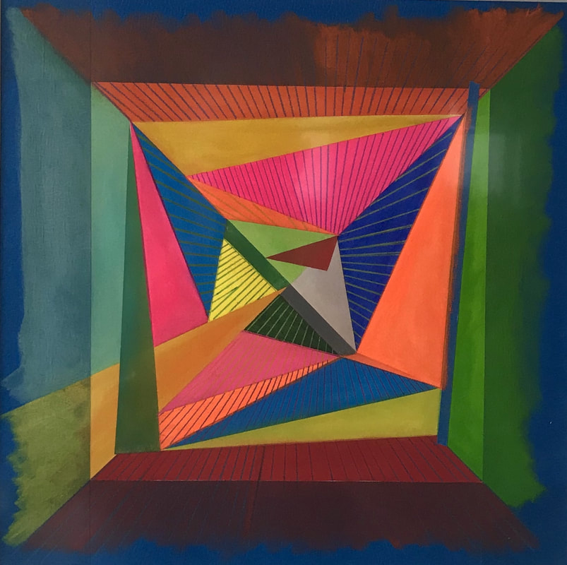
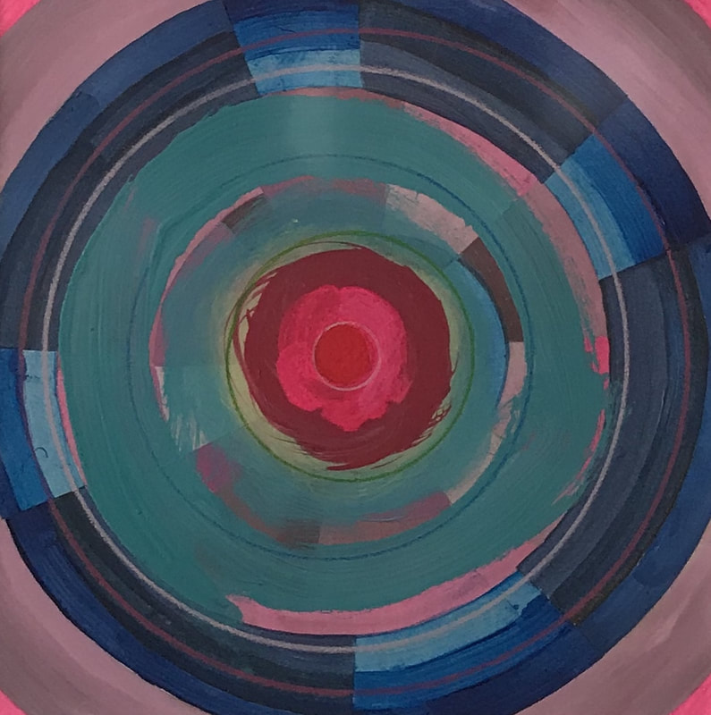
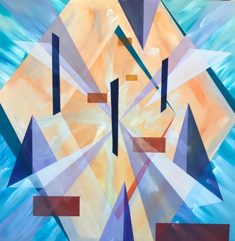
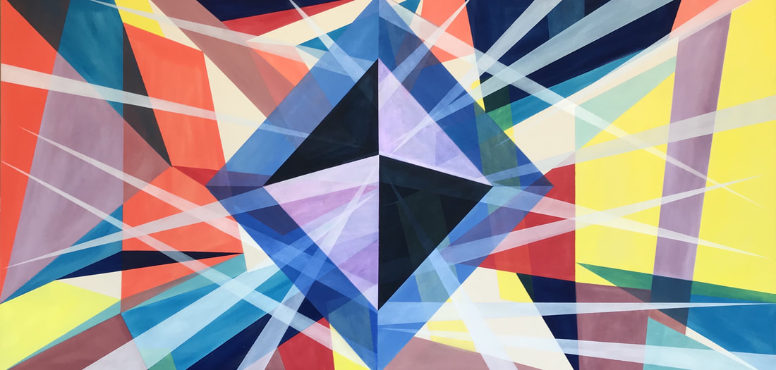
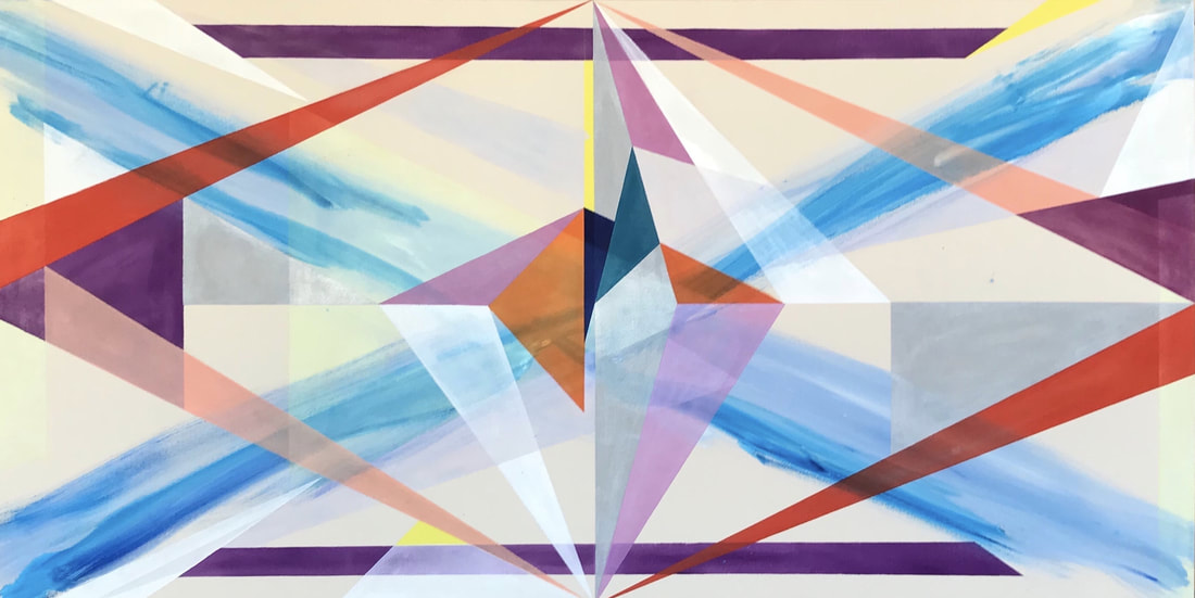
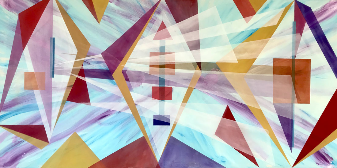
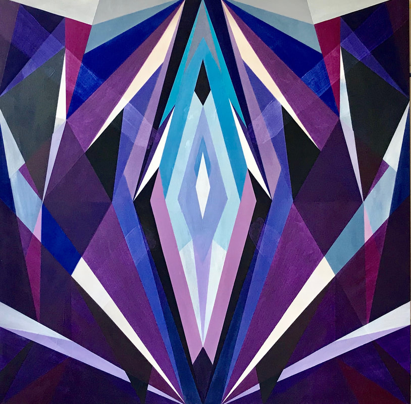
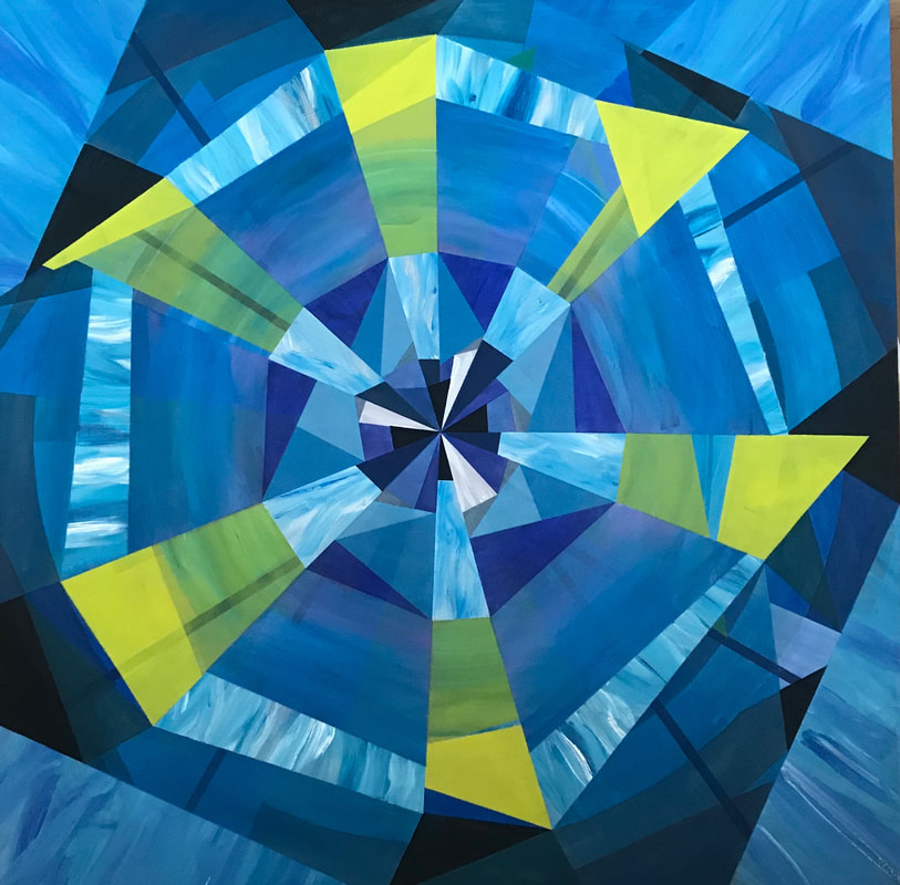
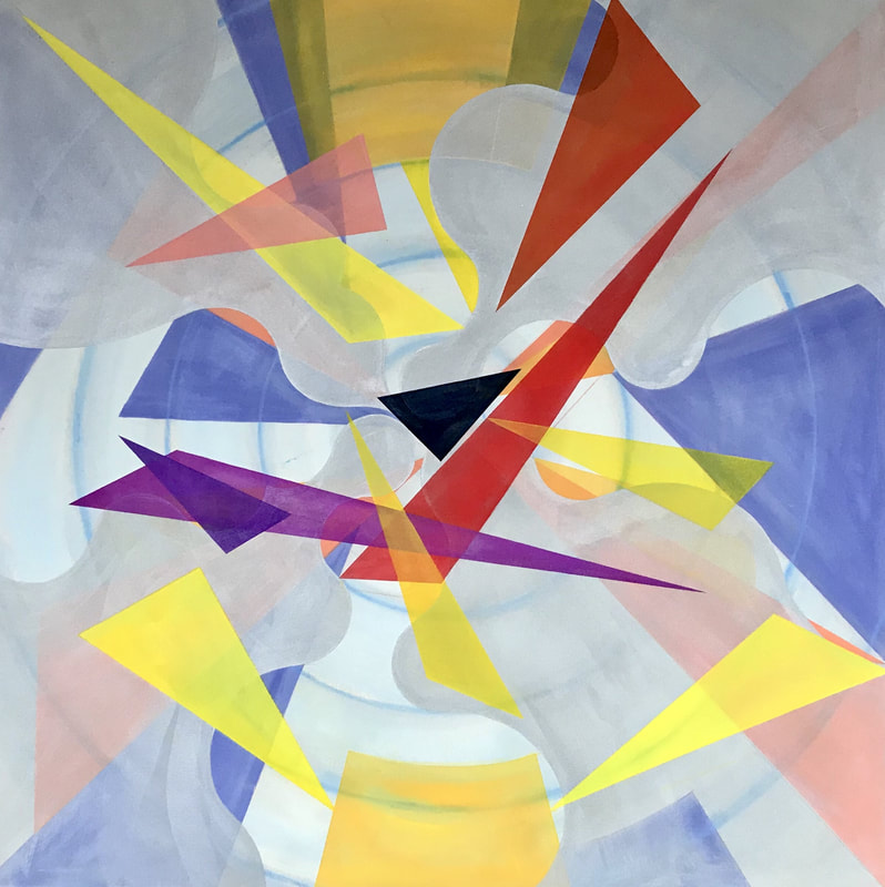
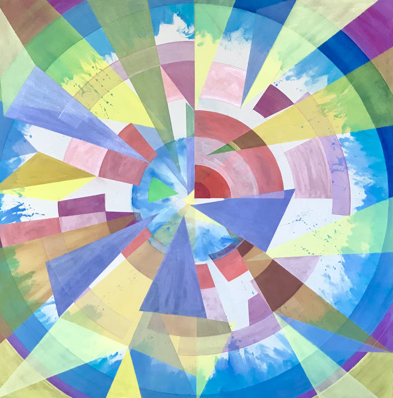
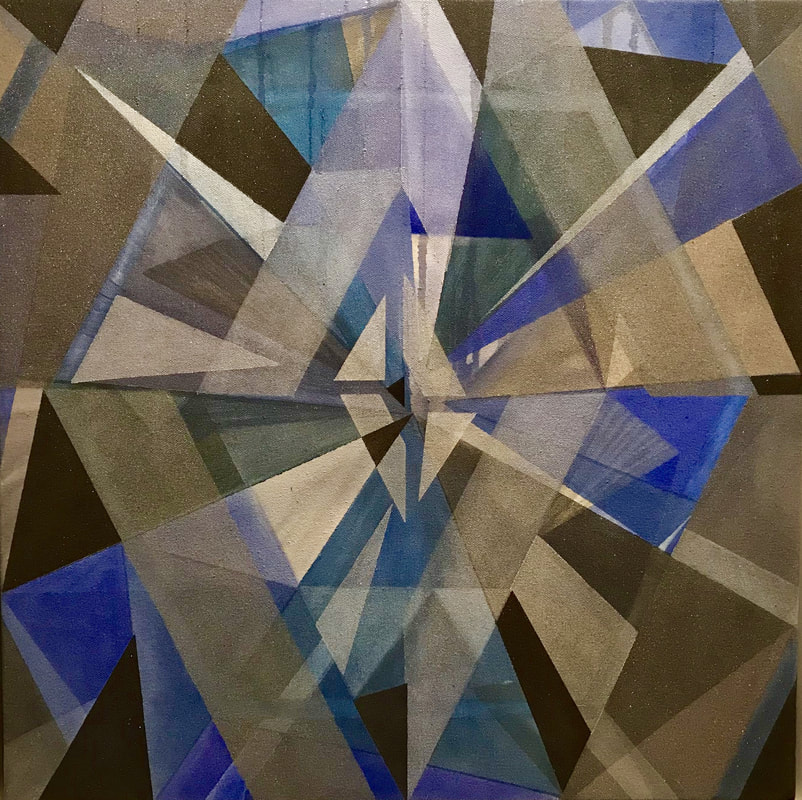
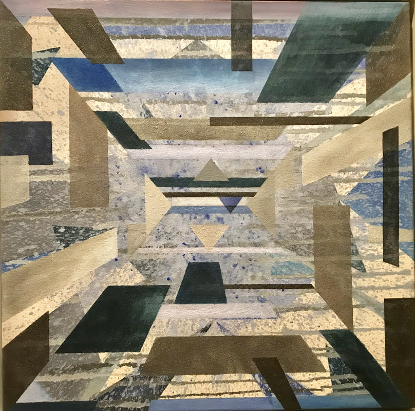
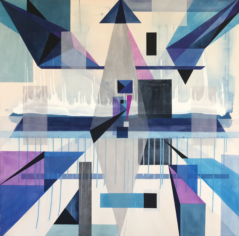
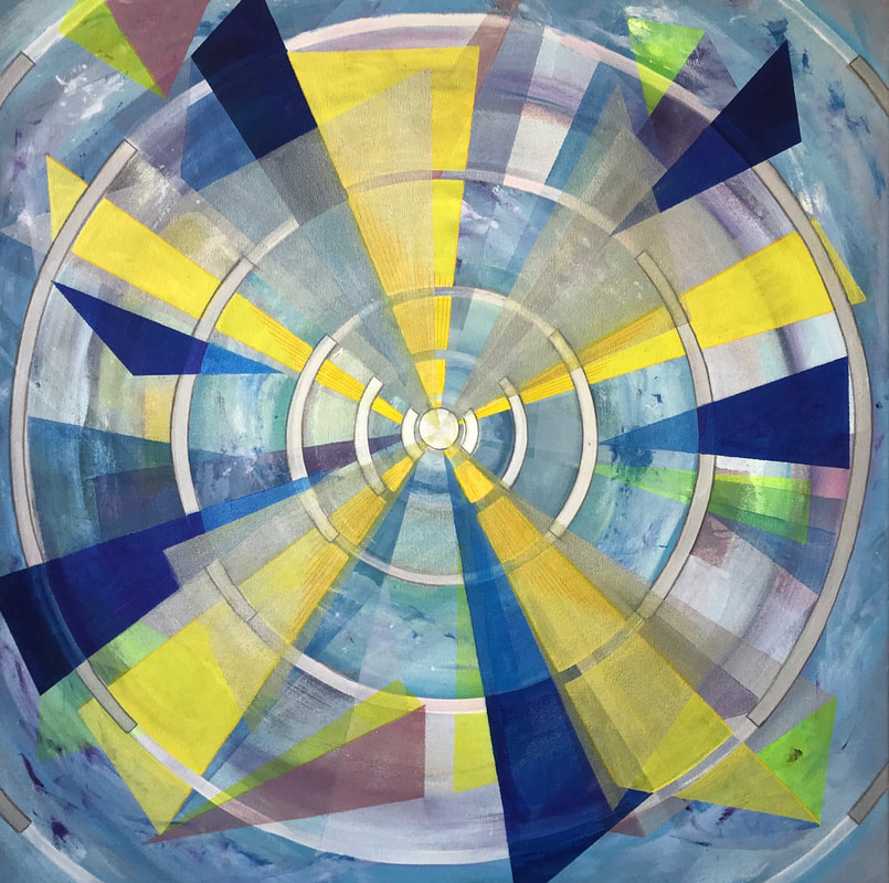
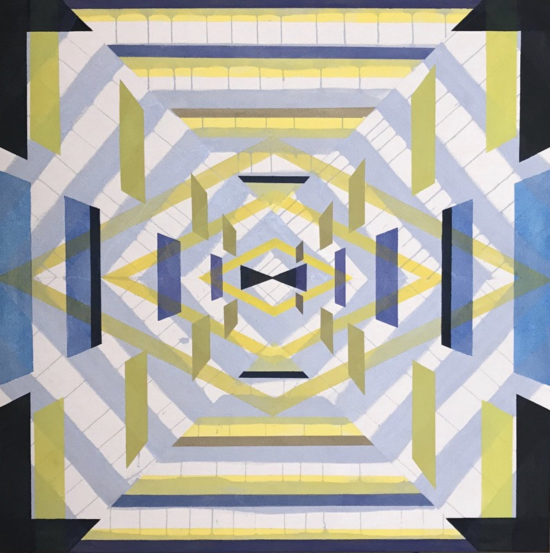
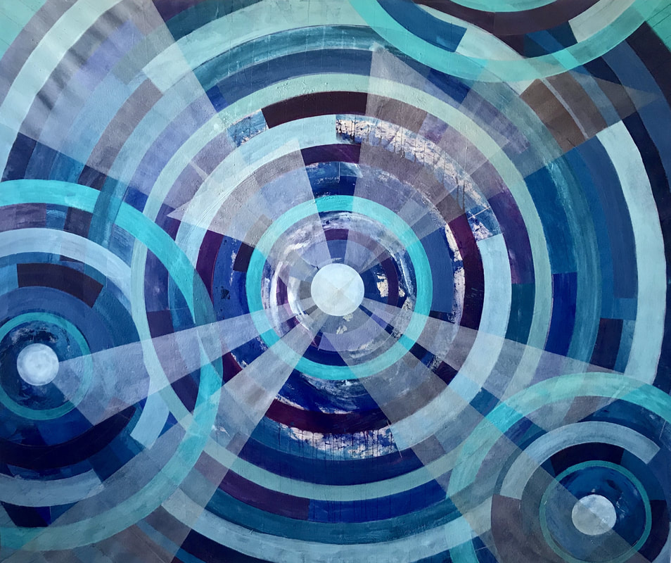
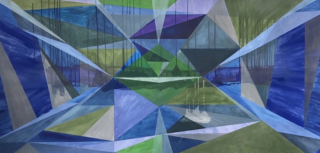
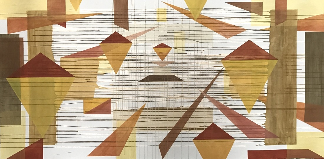
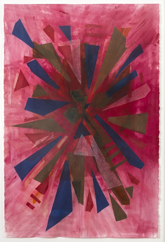
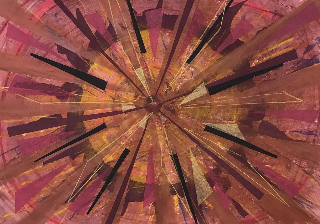
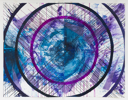
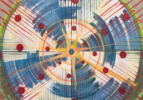
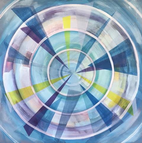
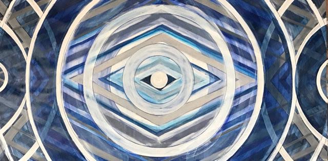
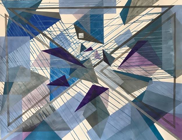
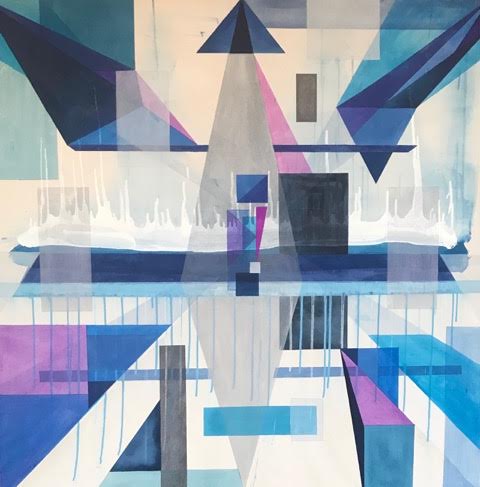
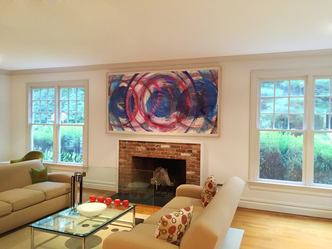
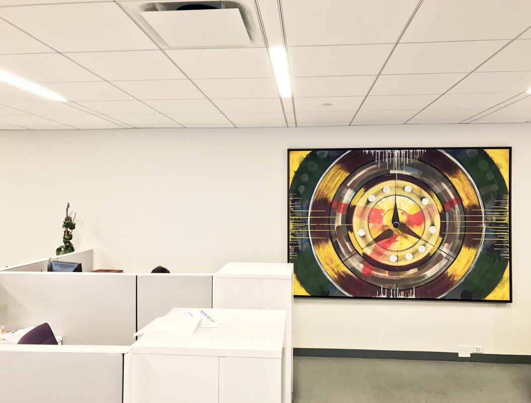
Steven Kinder (b. 1956, Queens, NY) was trained at Cooper Union and has been making drawings, paintings, and large-scale installation for over 40 years. His recent work advances his interest in various forms of dynamic tension and movement found in nature, specifically tidal bores, surges or whirlpools.
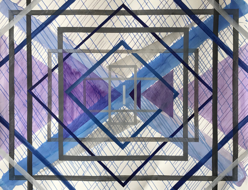
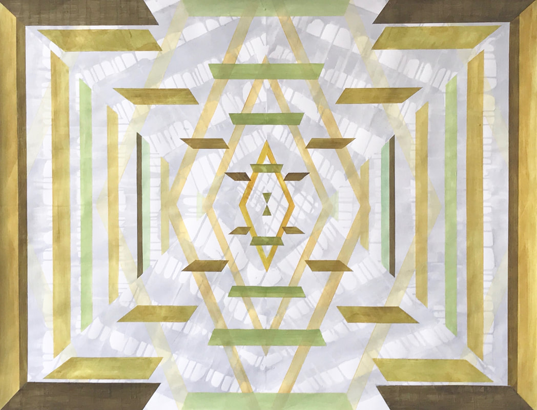
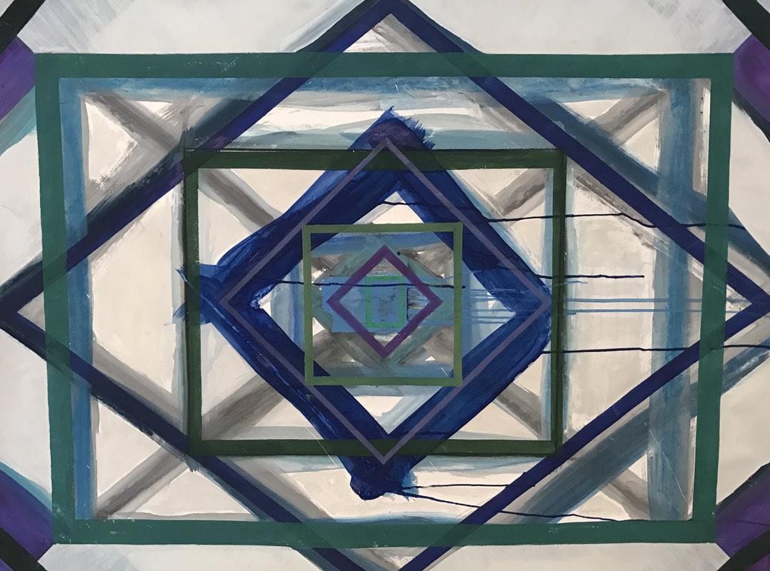
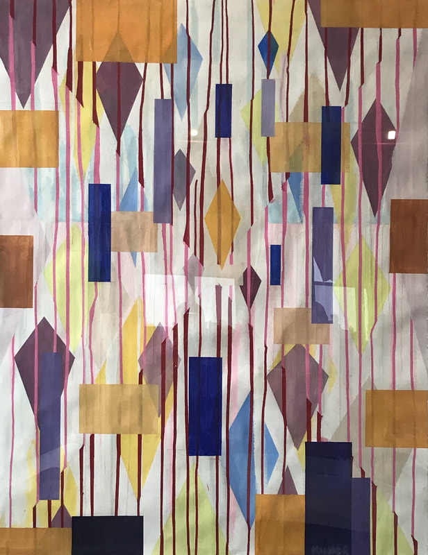
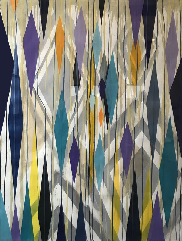
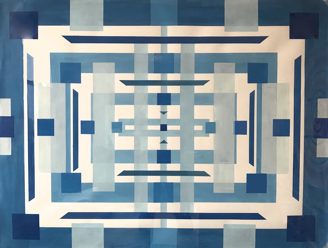
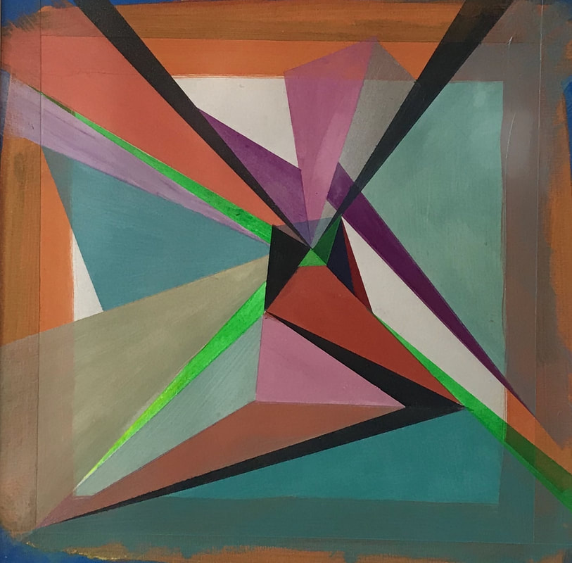
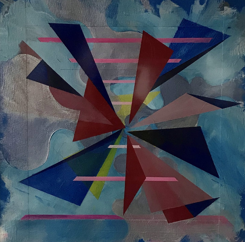
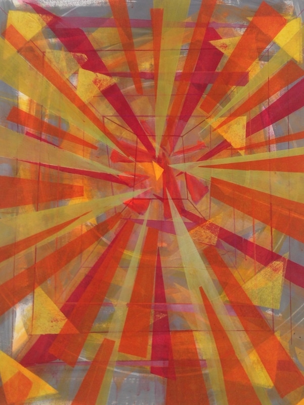
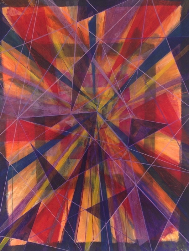
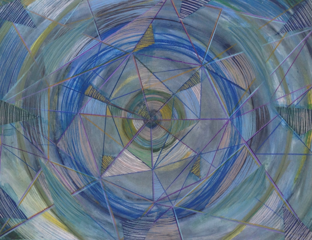
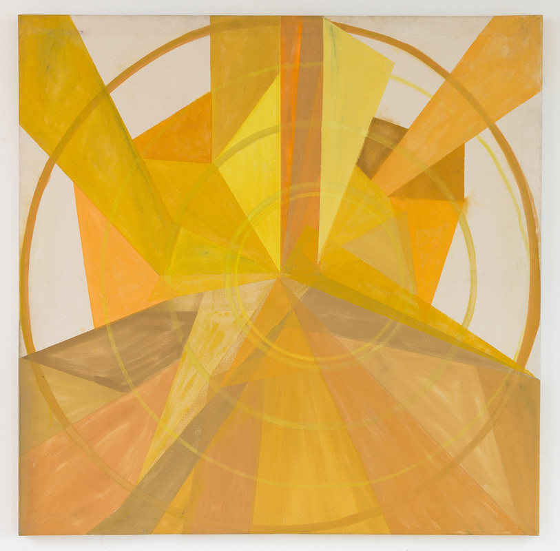
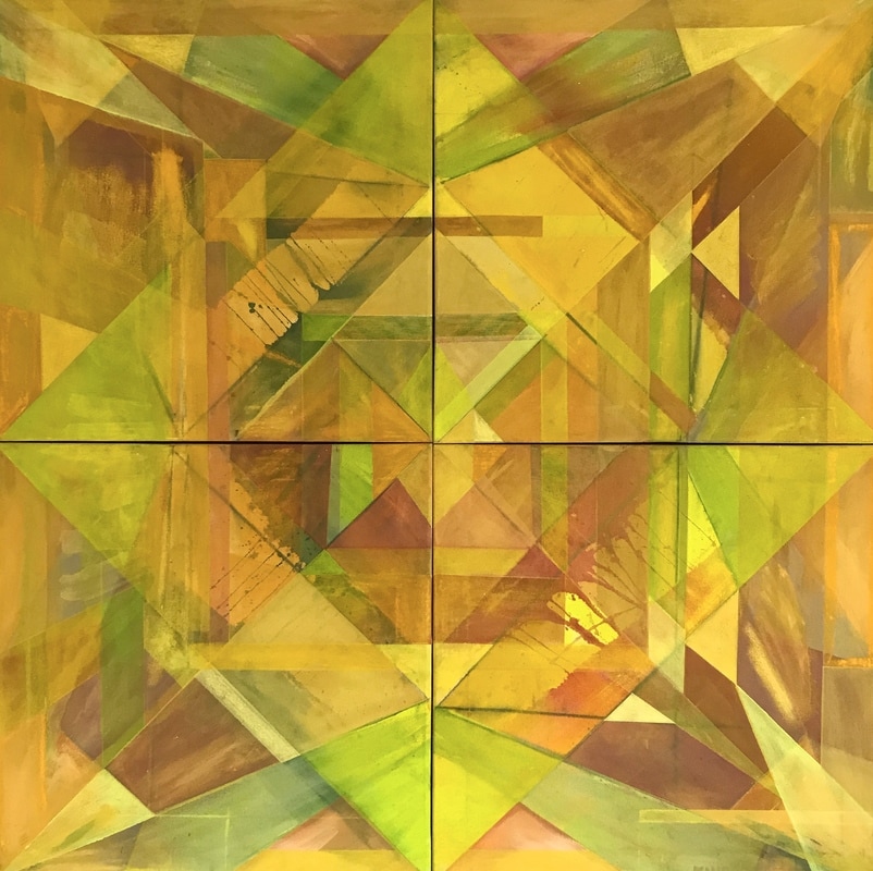
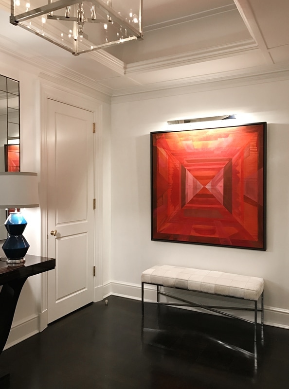
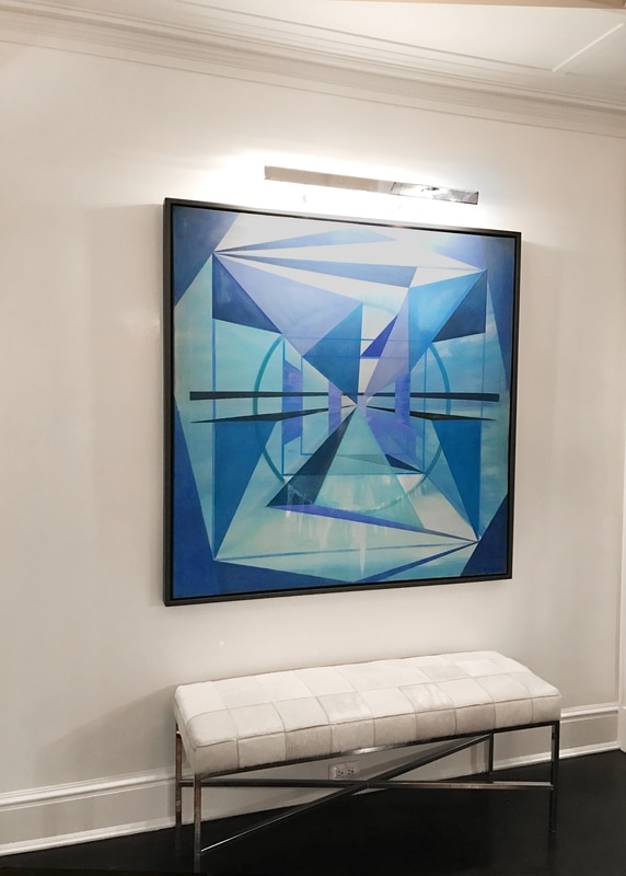
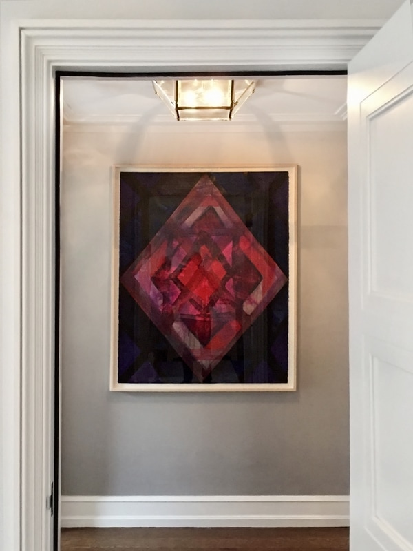
In his new work, the artist further explores tension and balance between the intuitive, gestural mark and the intellectual organization of form. His 9 inch square drawing series, a format he has been using for years, have now become templates for his paintings. In the drawings Kinder works out how form and color can come together and break apart while maintaining a compositional integrity inside a small space. His habit of placing ¾ inch blue painter’s tape around the edges of his designated area to serve as a border has now become part of the picture plane. The tape’s slightly elevated hard edge creates a physical barrier for the paint but adds a beautiful collage dimension as well. Its rough textured surface catches and slows the end of the brush stroke, softening the color and extending its energy over the intended border. Like a tidal pool at the base of a waterfall, the tape is both an extension of the thing, and a separate thing itself.
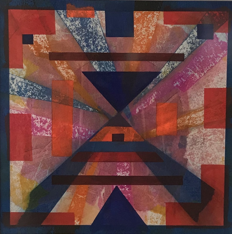
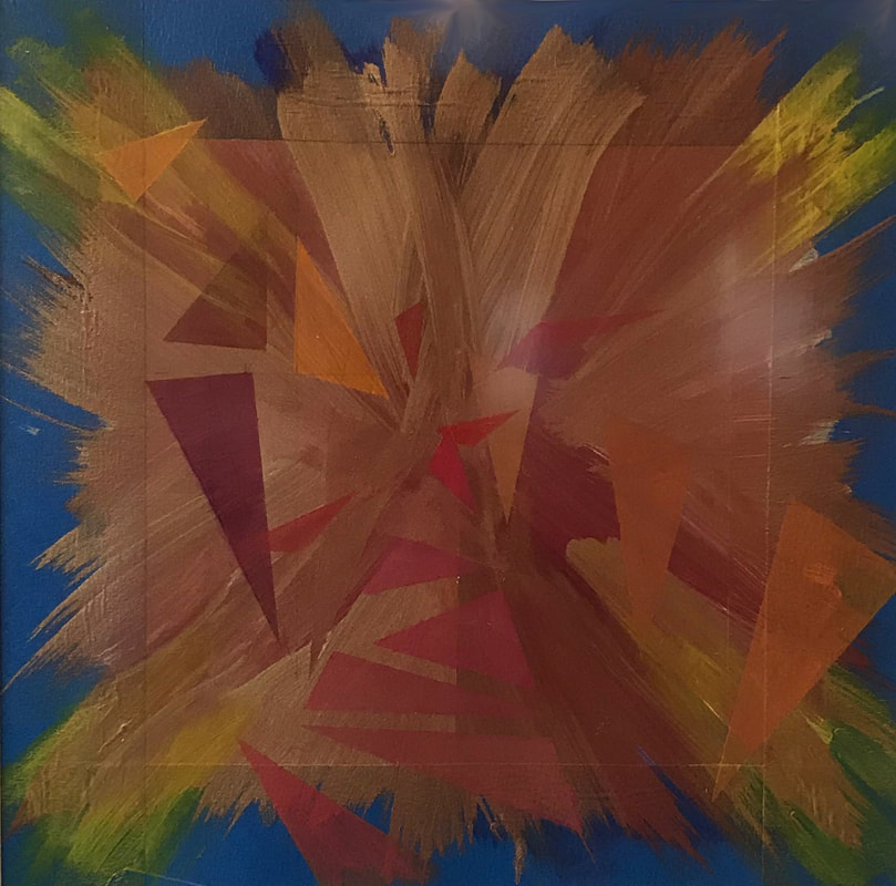
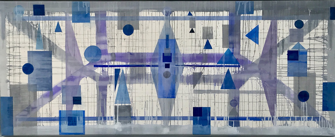
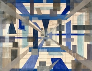
When Kinder translates the small drawings onto larger canvas, there is a palpable and necessary shift of pressure, color intensity and rhythm. He does not project the drawing on the canvas, nor does he use graphs. Instead he simply places it next to the canvas and refers to the drawing as an architectural blue print. He then translates the drawing’s composition onto the canvas freehand in a way that allows for the different medium to work. Where an area is densely painted in a drawing, its corresponding area in the painting may become translucent. Where a color might be a deep opaque hue in the drawing, it can evolve into a watery gestural, impasto stroke in the painting. Where a linear form is folded like delicate Japanese origami in the drawing, it could become a central architectural buttress in the painting. These changes are decisive and tactical according to the medium, but there always remains an ethereal sense of physical sensation – whether floating, glowing or moving through deep space.
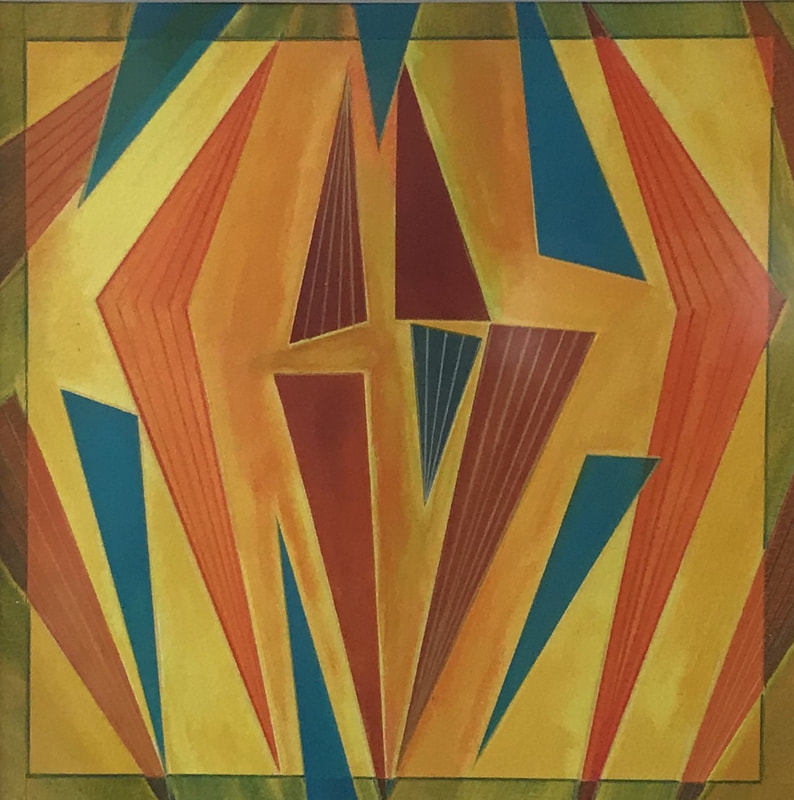
The works call to mind a little known moment in art history known as abstraction-creation, which was concurrent with Orphism, made famous by Sonia and Robert Delaunay in 1912. During this period, artists like the Delaunays, Frank Kupka and Albert Gleizes merged the cubist style with Fauvist color and advanced painting towards lyrical abstraction which focused on color and form solely to communicate meaning. Kinder’s own vivid colors are achieved through the use of high quality German raw pigments mixed with various mediums and acrylic paint in a kaleidoscope of colors: ultramarine violet, Bismuth-Vanadate yellow lemon, Bordeaux, Cadmium orange. What color can do and how it behaves on paper versus canvas has been a journey for him over many decades. It began with flat house paint that was lying around and surreptitiously began using it on raw, unprimed canvas. He thinned the paint down with warm water and continuously tried to work it into submission to achieve the movement and transparent clarity he required. When he eventually discovered raw pigment and linen it was a revelation. Translucency and pliability of the paint — and by extension its vivid color — was available to him in a way he never anticipated, which in turn gave his colors new vibrancy and his shapes new power.
Kinder’s fascination with the possibilities of color and shape to express vibration, movement and the essence of life force, as well as a powerful communicator of humanity’s sorrows, has historical precedence in the works of Wassily Kandinsky and his “triangle of humanity.” In a famous metaphor, Kandinsky likened humanity to an acute-angled triangle, whose base consists of the mass of humanity. At the apex of the triangle are a few beings, and ultimately often a single one: ‘His joyful vision cloaks a vast sorrow. Even those who are nearest to him in sympathy do not understand him. Angrily they abused him as charlatan or madman.’ (Catherine Wathen, Theosophy Forward, October 2009)
This will be Kinder’s forth project with George Billis Gallery and second solo-exhibition at the New York gallery.
Steven Kinder (b. 1956, Queens, NY) was trained at Cooper Union and has been making drawings, paintings, and large-scale installation for over 40 years. His recent work advances his interest in various forms of dynamic tension and movement found in nature, specifically tidal bores, surges or whirlpools.
In his new work, the artist further explores tension and balance between the intuitive, gestural mark and the intellectual organization of form. His 9 inch square drawing series, a format he has been using for years, have now become templates for his paintings. In the drawings Kinder works out how form and color can come together and break apart while maintaining a compositional integrity inside a small space. His habit of placing ¾ inch blue painter’s tape around the edges of his designated area to serve as a border has now become part of the picture plane. The tape’s slightly elevated hard edge creates a physical barrier for the paint but adds a beautiful collage dimension as well. Its rough textured surface catches and slows the end of the brush stroke, softening the color and extending its energy over the intended border. Like a tidal pool at the base of a waterfall, the tape is both an extension of the thing, and a separate thing itself.
When Kinder translates the small drawings onto larger canvas, there is a palpable and necessary shift of pressure, color intensity and rhythm. He does not project the drawing on the canvas, nor does he use graphs. Instead he simply places it next to the canvas and refers to the drawing as an architectural blue print. He then translates the drawing’s composition onto the canvas freehand in a way that allows for the different medium to work. Where an area is densely painted in a drawing, its corresponding area in the painting may become translucent. Where a color might be a deep opaque hue in the drawing, it can evolve into a watery gestural, impasto stroke in the painting. Where a linear form is folded like delicate Japanese origami in the drawing, it could become a central architectural buttress in the painting. These changes are decisive and tactical according to the medium, but there always remains an ethereal sense of physical sensation – whether floating, glowing or moving through deep space.
The works call to mind a little known moment in art history known as abstraction-creation, which was concurrent with Orphism, made famous by Sonia and Robert Delaunay in 1912. During this period, artists like the Delaunays, Frank Kupka and Albert Gleizes merged the cubist style with Fauvist color and advanced painting towards lyrical abstraction which focused on color and form solely to communicate meaning. Kinder’s own vivid colors are achieved through the use of high quality German raw pigments mixed with various mediums and acrylic paint in a kaleidoscope of colors: ultramarine violet, Bismuth-Vanadate yellow lemon, Bordeaux, Cadmium orange. What color can do and how it behaves on paper versus canvas has been a journey for him over many decades. It began with flat house paint that was lying around and surreptitiously began using it on raw, unprimed canvas. He thinned the paint down with warm water and continuously tried to work it into submission to achieve the movement and transparent clarity he required. When he eventually discovered raw pigment and linen it was a revelation. Translucency and pliability of the paint — and by extension its vivid color — was available to him in a way he never anticipated, which in turn gave his colors new vibrancy and his shapes new power.
Kinder’s fascination with the possibilities of color and shape to express vibration, movement and the essence of life force, as well as a powerful communicator of humanity’s sorrows, has historical precedence in the works of Wassily Kandinsky and his “triangle of humanity.” In a famous metaphor, Kandinsky likened humanity to an acute-angled triangle, whose base consists of the mass of humanity. At the apex of the triangle are a few beings, and ultimately often a single one: ‘His joyful vision cloaks a vast sorrow. Even those who are nearest to him in sympathy do not understand him. Angrily they abused him as charlatan or madman.’ (Catherine Wathen, Theosophy Forward, October 2009)
|
RESUME
|
